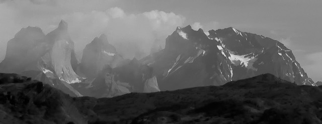
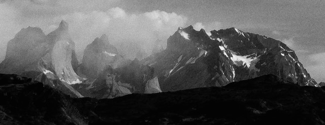
Six years ago I posted an image on this site that a lot of people reacted positively to. Here’s the image:

Now for a confession. I processed that image very quickly back in the hotel room that night. I actually was just looking for something to put on the front page while I was traveling. This was certainly not the best image I took that day. In fact, it was taken on a rest stop during a bus trip.
The camera that was used is a Sony NEX-5 with the kit lens at 18mm. Now the reason why I mention that is that not a soul in the world would claim that the Sony E-mount kit lens is very good at “micro contrast.” Let alone micro contrast at the bottom of the frame (edge of lens coverage). The camera in question wasn’t exactly noise-free at the sensor, especially since I had to lower the exposure on this image to keep the highlights from blowing, and there was very little red in the scene.
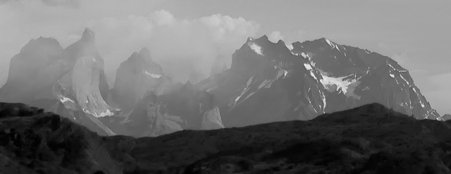
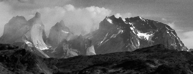
Before we get going, let me show you the actual image as it came into ACR:

You might already notice that the mountains at the bottom—the Cuernos in Torres del Paine National Park in Chile—don’t seem to have a lot of contrast to them.
Indeed, I’d guess that almost any so-called expert on lens rendering would immediately say that there’s very little micro contrast.
What the hell is micro contrast, you ask?
Good question.
Contrast, after all, is the difference between two values. Some contrasts are easy to see. For instance, the difference between the bright snow on the mountains and the dark rocks. Contrasty. One’s white, the other at least dark blue gray in this image. But how about between any two pieces of the rock? Indeed, between two adjacent pixels that are rock?
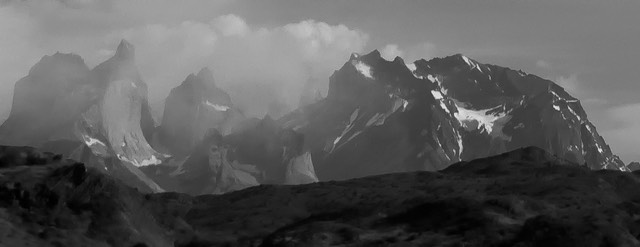
The micro contrast experts all contend that lenses with “great micro contrast” will pick out the differences between two adjacent pixels of rock and add a “3D-like effect” to the image. Uh, okay. Let’s look at that with a lens that they’d claim has no micro contrast. Here’s the section of the image we’re going to look at:

Most people writing or talking about micro contrast will instruct you to convert to monochrome. Why? Because then we see the actual contrasts without color information that might fool us. So let me desaturate the mountains in question:
^
Look at the face of the peak with the chisel on top that’s over towards the left. The face looks a bit “bland.” Hmm, no micro contrast then? Must be the lens.
This is a blue channel conversion using Channel Mixer. Wait a second, is that a little worse in micro contrast? Isn’t this the same lens?
Here’s the green channel conversion using Channel Mixer. Better than the blue channel, but still not great.
Here’s the red channel. Better still, but that wall below the chisel still doesn’t pop and have anything approaching what I’d call a 3D effect.
Hmm. That’s different. Note how some of the details are coming out in the wall (though noise is present in this rendering).
This, too, is different. Here I’ve used Clarity to pull values apart in the mid-tones and give them more contrast.
Wait, what happened here? (A Structure tool. Most B&W converters have them.) Look at all that detail in the wall now! Lots of micro contrast, it seems, though the noise in the sky is starting to be a big problem (mostly because the red channel has very little value to it, so the more extreme processing is starting to emphasize the noise in that channel). So, wait, is micro contrast a lens thing or a post processing thing?
In my world view, it is both. There are things in the lens and in the demosaic that will enhance or reduce contrast between fine detail and subtle tonal changes. Remember, the demosaic is looking at neighboring values to calculate the RGB value for a particular pixel. That’s like reducing micro contrast.
In the lens, micro contrast is often reduced by veiled flares of some sort or another. The more air-to-glass surfaces a lens has, the lower the contrast differentials that are passed. Yes, coatings can help this, but no air-to-glass surface moves 100% of the light through unchanged. This is one reason why you shouldn’t use a filter unless you absolutely need the effect it produces: it will add veiling flare.
One problem we had with early DSLRs is back flare. The glass/filter over the sensor had high reflectance, so tended to reflect back some of the light reaching it. Before lens elements started getting coated on their backside, that light then came back to an element and competed with the light that was getting through. Even today, though, not all elements are back coated. Generally only either the front or back element, or both, are.
You might note that when you look inside a lens that most of it is black. Well, not quite black, more typically a dark gray plastic or dark gray painted metal. The theory here is that you don’t want light getting to the inside of the barrel of a lens and reflecting back to the middle of the lens. Some lenses have elaborate baffles in their barrel design so that light doesn’t reflect in any particular direction, some are simple, almost black tubes. But in most lenses I’ve looked at in tear down, there are internal parts that are more reflective than others. Yes, that can make a small bit of difference.
But as you might have started to notice in the above examples, color might play a part, too. And there we’re at the mercy of the camera and lens makers for the most part. Every camera maker seems to think that spectral sensitivity is a state secret that, if revealed, will cause the castle to collapse. Just the opposite, actually.
Some Nikon DSLRs are slightly more sensitive to red channel light, some slightly more sensitive to blue channel light (they’re all highly sensitive to green channel light). One dead giveaway is where the zero point for white balance is. I’ve seen it range from the low 4000K realm to the 5000K point across the various Nikon bodies over the years (typically it seems to be in the 4600-4800K range). That means that the light that gets to the sensor is biased slightly towards red or blue, depending on the camera.
What about the lens coatings? How are they biased? Good question, isn’t it? If you had a lens whose spectral pass-through was optimized for, say, a center of 5400K and a camera whose spectral pass-through was optimized for 4400K, is it possible that micro-contrast is affected? Absolutely, though it would depend a bit on what you’re photographing and what colors are in it.
Then we have the demosaic. For years Nikon DSLR owners have been saying the same thing about Capture NX processing versus Adobe ACR: the Nikon processing has better color and a bit more contrast in a straight conversion. Some of this is the spectral choices, some of it is that Adobe assumes a linear response between two test points, some of it is just that Adobe doesn’t have all the data that Nikon does. A lot of Adobe users almost automatically crank up the Clarity slider. Why? Because it increases the so-called micro contrast in the mid-tones.
Now don’t get me wrong. I’ve long seen that some lenses do indeed produce more useful and easily observable contrast on small tonal differences than others. Those lenses tend to be ones with simple optical formulas, which suggests that both air-to-glass impacts as well as trying to do too much with things like aspherical polishing and how the optical formulas sometimes try to stretch or compress the optical path—as often happens in zooms—must be to blame.
But micro contrast is a much more nuanced problem than that. As I’ve tried to show here, even a lens—and position on that lens—that would be regarded as poor in micro contrast is still passing useful contrast info to the sensor.
You can get yourself tied up in a knot about micro contrast. Yes, if the lens is better at moving the light through without veiling anything, it’s a better lens, all else equal. But that doesn’t necessarily rule out using a lens with lower micro contrast. These days, most lenses are very good at all types of contrast, and a few are excellent at it. But there’s generally not enough difference there that I’d get over obsessed with it. As I’ve tried to show here, post processing most certainly has an impact on what you see in the finished image in terms of small detail and tonal ramp contrast.
You’ll note that in my lens reviews I rarely mention micro contrast. I think you know why now. Trying to distinguish between what was the lens’ contribution and what was the demosaic’s contribution (or deduction) is a fool’s errand. I do sometimes mention micro contrast with a lens when it is so exceptional that it can’t be ignored and must be an attribute of the lens, though. The Zeiss Otus lenses are one good example of that.